Welcome back, folks! I have just completed week two of my six-week One Room Challenge. For this week, I wanted to establish a nice neutral color to serve as a canvas for my dining room to home office renovation. That is why I chose to paint with Sherwin William’s Repose Gray.
Did you miss week one? No problem. You can head over there and see the plan for this renovation.

(This post may contain affiliate links (*). That means that I make a small commission from sales that result through these links, at no additional cost to you. You can read my full disclosure here.)
Repose Gray is one of those colors that just goes with everything. It works in design styles from modern to traditional and everything in between. It is one of those go-to colors that every interior designer falls on when they want to have a neutral base that can bend and adjust to every season and still maintain a fresh feel.
It has a light reflective value of 58. Since LRV goes from a value of zero (appropriate for vampire types) all the way to a value of 100 (may cause squinting), repose gray is perfect if you want to have a paint color that is cozy but doesn’t suck up all of the light.
In fact, in most rooms with at least one natural light source, you will notice that repose gray tends to brighten a room. It is a big improvement over my previous paint color, Tony Taupe.
Just for references, tony taupe is more of a golden beige that has a LRV of 37. So, quite a bit more of a light hog. It is still a nice color choice, but if you are looking to have the trendier gray interior, maybe not so much.
I have been taking my photos using just natural and ambient lighting for the painting process. The good thing about doing it this way is that you get a true feel for how the paint color affects the overall mood (i.e no artificial flash to make the images look cheery).
As you can see from my before image, it tends to suck up most of the light and make the room look a bit dreary. In real life, the room looks nicer. But it takes a ton of lighting to make it look vibrant and lively. But let’s move on to the renovation process.
Preparing to Paint With Repose Gray

The first thing that I did before painting was to remove the chair rail. While I love detail work like chair rails, they can have a few downsides. First of all, they can visually make a wall look shorter than it actually is.
That’s usually not a problem if you have 9 ft. ceilings or higher. This ceiling is 10 feet high and has an extra two feet more with the tray ceiling. So, I wasn’t hurting for space. If you want some tips on how to make a ceiling appear higher, be sure to check out my post on creating the illusion of high ceilings.
However, I don’t think the chair rail lends itself to the office space that I want to create. Plus, it will detract from a feature that I have coming up. (pst. That part is still a secret).

Anyway, I removed all the outlet covers and then removed the chair rail. I had to plaster and sand the area beneath the chair rail to get a smooth surface. If you are careful and use my tips for removing trim, you can get a very clean removal. This makes it so much easier to patch and paint.
You can see how much brighter the new paint is compared to the old one. I am also repainting the ceiling, going from Sherwin William’s Accessible Beige to Sherwin William’s Spare White.
You will also notice that I am using scaffolding* and a large canvas to protect the floor. Having scaffolding is a big help when working with high ceilings. This one has been with me for a few years and is perfect for anyone looking for an easy-to-assemble system that breaks down into flat components.
Speaking of getting good paint results, I have a full post dedicated to achieving professional paint results. If you want to get the most from your paint job, be sure to check that out.
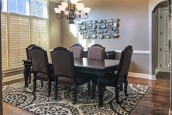
What I really love about repose gray paint color is that it works so well with a slew of different wood floor finishes. You can see how my darker floors really pop against the color.
Most people assume that gray won’t work with such traditional flooring but in actuality the contrast accents everything nicely. I have used it with lighter honey-toned wood floors, too. It truly is a universal color.
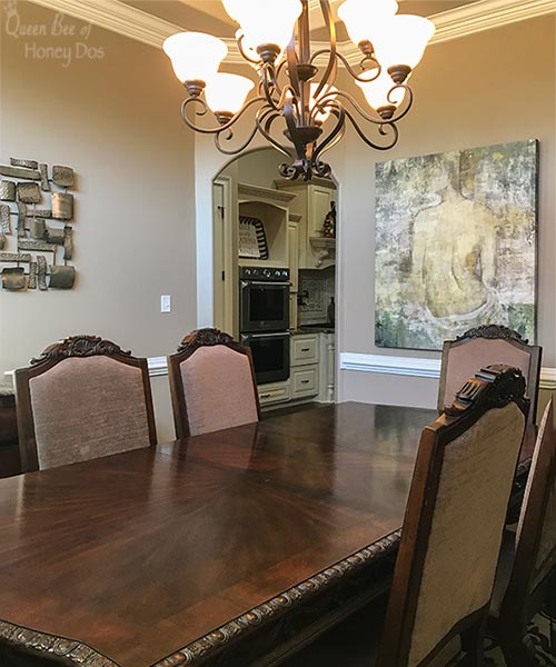

It even looks nice with my very golden-toned artwork. I was so pleased to see that my lady will still work in this space. I was afraid she would look dated next to this modern color, but I think it ended up making the artwork look current.

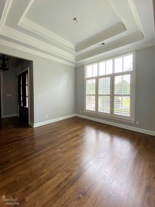
This is the view from the living as it appears on a cloudy day. You have probably noticed that the chandelier is gone and I am giving you a good view of the ceiling. (hint, hint).
All I am going to say is that you really want to check back in next week to see what I am doing for part 3 of this renovation. See ya next Thursday!
Home Office -Week One (The Plan)
Home Office – Week Two (YOU ARE HERE!)
Home Office – Week Three (Chevron Plank Ceiling!)
Home Office – Week Four (DIY Drop Cloth Drapes)
Home Office – Week Five (Drum Chandelier Makeover)
Home Office – Week Six (Home Office Reveal)!


Please keep it clean. Comments that do not follow the Comment's Policy may be removed.